Scullery + Powder Room Plans | Part 2: Scullery Design Plan

We are well underway in the scullery but I wanted to walk you through the design plan as well as my thought process for the design. However, First things first.
For anyone who doesn’t know what a scullery is:
scul·ler·y
/ˈskəl(ə)rē/
noun HISTORICAL
1 a small kitchen or room at the back of a house used for washing dishes and other dirty household work.
Don’t worry if you didn’t know, many people living in the US do not. The term is more commonly known in the UK since that is where it originated. Otherwise, typically anyone who’s been enlisted in the navy has knowledge of a scullery - and they often do not have fond memories of a scullery duty. They usually ask, “are you building a second room for dishes?” Well technically yes, if that’s what you’d need to do sometimes.
Purpose
Really though, we’re building this space not because we have a ton of dishes, but because when we moved in, the room was a wasted pass-through between our kitchen and the back porch. I wanted to make use of this space. And decided the best use of it would be for a multitude of things: wet bar when we’re hosting guests, floral arranging space, dog food and recycling/garbage storage. Also, my brother who is a chef has always told me a kitchen is useless with only one sink. So there you go Eddy, I did it. I put a second sink in the kitchen! The conclusion to all those needs was a second utilitarian kitchen, aka a scullery.
Design Plan
Scullery Floor Plan
Aside from being the most effing productive room in the house, the scullery also is going to be beautiful. I was inspired by its namesake, the sculleries of the UK that are utilitarian beauties. Simple, clean lines, moody drab walls, humble materials. In this home, that translates into beadboard walls, a moody paint color, a farm-sink, butcher block or potentially soapstone countertops and a painted wood floor.
Scullery Color Palette, Design by Lauren L Caron, Studio Laloc
Image courtesy of Farrow & Ball
The color palette originally was going to be based on the kitchen color palette of French gray and off-white, but if you follow me on instagram you’d see that I had a change of heart. The new color palette is derived from the colors in the curtains we’re installing in the kitchen (pictured above) they have a slight touch of muddy, peachy-pink in the background of shades of gray-green florals. The perfect paint color version of that muddy pink is Dead Salmon from Farrow & Ball, a color I’ve loved for years but have never had the right use for. For the cabinets I wanted a grounding color so I selected a brownish, purple, black color called Deep Caviar from Benjamin Moore. Universal black doors and for the floors the original plan was going to be a solid dark army green, a nod to the military connection. But! I changed that plan as well and decided the floors needed a touch more energy than a flat floor color - more on that later. The other finishes are light maple wood with accents of brass and oil rubbed bronze. We are using cabinets that were mistake cabinets from the kitchen. Remember all the issues we had with our cabinets? Well all those extras that were built incorrectly found the perfect home in this room. Aside from pulling color palette from the curtains, I found an image that sealed the deal for me. It’s a kitchen painted in Sulking Room pink with almost black cabinets and butcher block counters. I hate to be doing almost the same thing, but it also feels really good to know this palette (or even a version of it) works!
Making it Functional
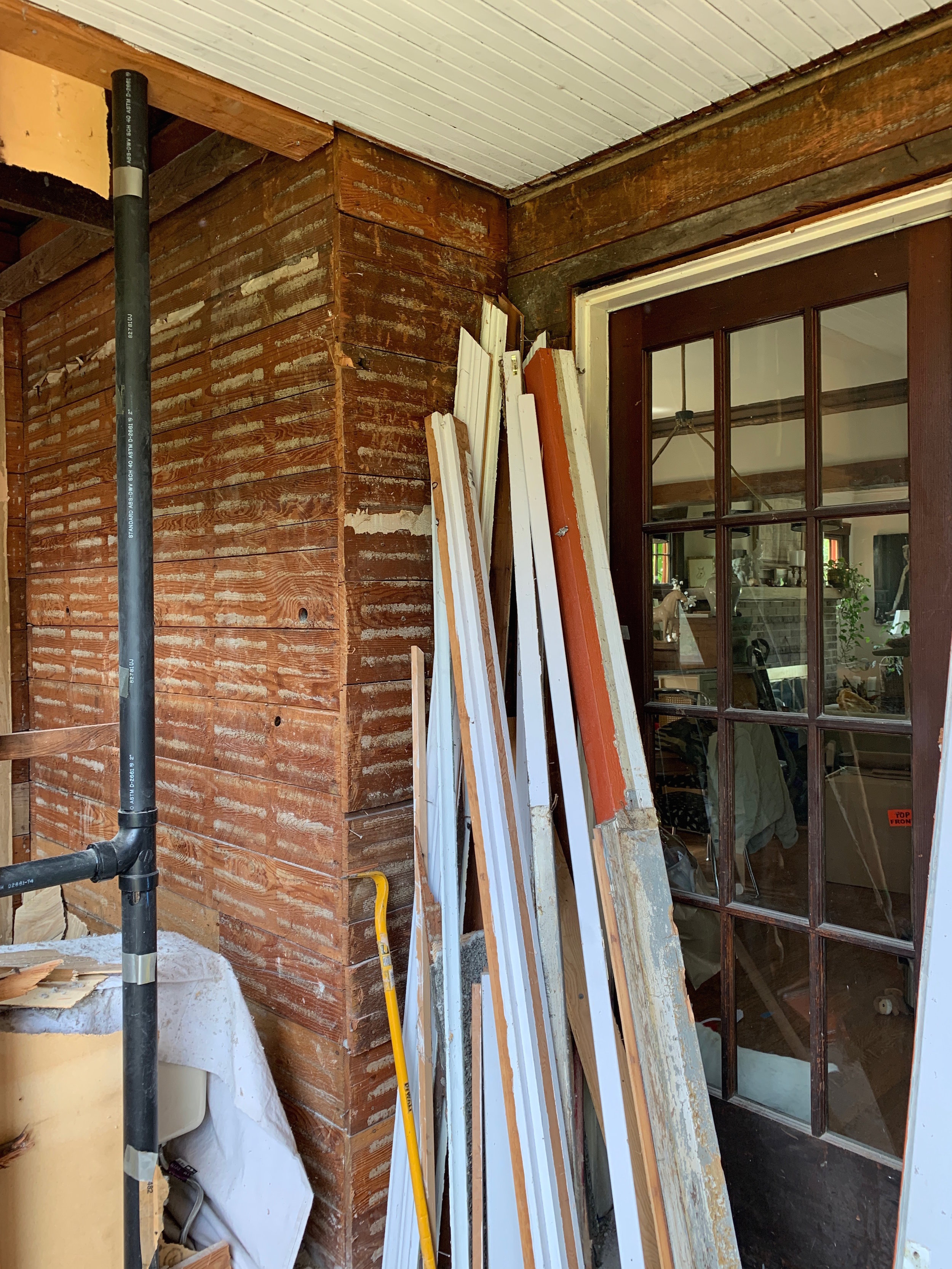
In order to get the room to layout and be functional to the expectations we have, we needed a long wall that would house the sink, beverage cooler, and garbage. Our only wall option for that was the wall that backs up to the powder room. This meant that we needed to close off the French door from the dining room permanently. That door was one of the original doors to this space so it kind of makes me sad, but it was our only choice in the matter. In order to feel better about my decision I am going to make a narrow cabinet out of that door frame in the dining room that will be backed with mirror and set with shelves to hold glassware. More on that when we tackle the dining room.
In the scullery, by closing off that door we’ve allowed ourselves enough depth for a 24.75” standard counter top. The upper cabinets are also from mistake cabinets that were built for the kitchen. I’m considering them a perfect happy accident, because they’re only twelve inches tall and deep. A sort of custom design that will allow from more overhead space to set baskets and other large vases. Also, I love that we were able to add a shelf below with a run of ‘S’ hooks from a metal rod to hang and hold items that will be high enough to not interfere with what’s happening on the countertop.
Another step to make this room more functional was that we had to install a new door, exterior wall, and window. We found the best antique door from the Pacific Galleries several months back that is a Dutch Door - basically my dream come true. We shrunk the window down to accommodate space for new outdoor wall sconces that will flank the Dutch door. The smaller window was made to order by Marvin windows through Dunn Lumber - it will match the powder room window and from the exterior look purposeful. Below the window is a countertop and small cabinet - another mishap cabinet from the kitchen. This will be an extra cabinet for storage of utensils and perhaps dog supplies and counter space. It’ll be in view from the front door so I have to be diligent about keeping this countertop clean. Always.
Hidden Door In Scullery | Progress shot by Lauren L Caron © 2019
If you caught it in my insta stories you’d know that we put in a secret door as well. This one actually fits within the old original door frame that led to the kitchen (the space that currently houses our bench seating). Jack figured out how to make the hidden door with the beadboard so that it’s virtually invisible. In this shallow space we’re planning to hang brooms and a folding step ladders.
Design Details
For design details I’ve decided to not put baseboard trim in this room. I think it will keep the hidden door more hidden and add the to the utilitarian mood. I am planning to paint the door between this room and the kitchen and the Dutch door both black. We also covered the last bit of pebble dash with drywall and to save jack some trauma we did not add beadboard to that beam.
The door between the kitchen and the scullery is also an antique store find from the same booth at the Pacific Galleries. This door has a beveled glass mirror panel and is made of old fir.
A major detail that I’m most excited about is the cabinet skirt - similar to below image. I chose a ticking stripe textile (above palette board) that I used for the kitchen bench cushions.
Lighting + Finishes
Scullery - Lighting + Finishes Board | Studio Laloc © 2019
Reath Design | Brentwood Project
For the ceiling light, we used a mostly free fixture, that was already in the house. It’s old enough though to not have the proper modern electrical components needed to install the light. At Lowes we found a canopy that holds the light bulb and mounts to the ceiling. The lamp fixture is large enough to mount over top of the canopy and cover it. At the last minute I changed my mind on the wall sconce and decided to use the second one of the pair of hand sconces I bought from Urban Electric Co.
For the finishes, we’re going with brass and oil rubbed bronze. The sink faucet and drains are going to be the dark oil rubbed bronze, while the hardware and base of the light fixtures are unlacquered brass.
Next Steps
Since I began writing this post we’re very close to finishing this room. Jack just installed some of the last details this evening. I am planning to style and photograph this space soon. In the next post of this series I plan to walk through the design plan of the powder room, even though it’s a going to be a little while before we get going on it, I imagine it’ll be fun to get a look at that space!


