Fall One Room Challenge: Week 2

If you’re new around here, thanks for stopping by and welcome! I am Lauren Caron, an interior designer and the founder of Studio Laloc, an interior design firm based in Seattle, Washington. On the side my husband and I are remodeling our home that I’ve given its own hashtag #ourseattlecraftsman. We’ve renovated our kitchen, scullery, and in the last One Room Challenge, we renovated our powder room. I’m excited to be participating as a guest again and hope you’ll follow along as we remodel our dining room! If you missed last week’s post please check here to read it.
WEEK 1 POST
We’re well into week two and while we haven’t done much to the space yet, we’ve been working our way through the to-do list. Since this room is mostly decor and furnishing I’ve been working on sourcing, placing orders, and coordinating with vendors. As I mentioned last week, the majority of this room will rely on vendors and craftspeople. In the past week I’ve placed orders for the window treatments (hardware, fabric and fabrication), lampshades, mirrors, and glass shelves. I also began testing out the paint samples to figure out which blue paint color I would use for the ceiling paint.
Selecting the Right Blue Ceiling Color
I started out with only three paint colors initially and thought it would be an easy color to choose looking at the light blues from the Farrow & Ball deck. However, after putting them up on the ceiling, they all felt a little dark. The colors I first pulled were Borrowed Light, Light Blue and Skylight (pictured below).

Dining Room Progress Shot

From Left to Right: Borrowed Light, Light Blue, Skylight
For the next round I ordered two more Farrow & Ball colors and two Benjamin Moore paint colors. BM - Gray Lake and Pale Smoke. F&B - Pavilion Blue and Pale Powder. After putting paint up on the ceiling and let it sit overnight, I decided that Pale Powder, which actually has a lot more green than the others is the best color. Not exactly what I was planning on doing, but yet again green seems to feel better in this house than a cool blue, so we’re gonna run with it. I ordered the Pale Powder today and will be getting it up on the ceiling as soon as possible.

The colors from left to right, back to front are: Borrowed Light, Light Blue, Skylight, Gray Lake, Pale Smoke, Pavilion Blue, and Pale Powder.

Now aside from sharing the process, I’d love to talk about the reasoning behind the decision on a blue ceiling. For my home like all my client projects, I appreciate a story and the reasoning behind the decisions we make on homes. My motto is that our homes should be reflection of us, and be able to tell the story of the people who inhabit them. My story is very much influenced by my mother’s decorating choices so, I like to include a nod her style within my home, once in a while. I also love history. So the blue ceiling does a bit of both for me and here’s why.

My Mother’s Dining Room
Several years back, my mother painted her dining room ceiling. She said it was because the light blue color helps the ceiling feel taller. The light blue ceiling recalls the sky, creating a slightly more atmospheric ceiling than a ‘blank’ white ceiling.

Design by: Isabel Lopez Quesada
A little History behind the Blue Ceiling
With a little more research I learned a bit more about the reason for painting ceilings blue. The concept of painting the ceiling light blue like the sky, also doesn’t feel totally ‘out there’ as perhaps a red ceiling might. As was explained in Architectural Digest. They also explain the second reason is that the color blue is rooted in luxury. “Historically, blue paint was quite rare, so having enough to slather on the ceiling indicated true wealth.”
Now, I had no idea of that latter concept. Which is probably why painting a dining room ceiling blue, a space in which you would historically entertain in, would make sense as the space to present one’s wealth. I’m of course not going to paint our ceiling because of that, blue paint doesn’t cost any more than any other color these days. But I am painting it in hopes that it will make the height of the ceiling feel taller.

One more instance where I learned about blue painted ceilings, that I think is important to mention has to do with the history of enslaved people. Yes, yet another instance where our country has appropriated a cultural tradition from the enslaved Africans. More prevalent in the south, but also found along the east coast and in the northwest, houses built in the Victorian era had porches painted light blue. The tradition was adopted from the Gullah/Geechee people who are descendants of enslaved Africans, brought to Charleston, South Carolina in the 1500s.
The Gullah people maintain a strong spiritual tradition that informs their rituals and even their home decor. For the Gullah, a haint is a wandering spirit, a lost soul that might wish evil on the living. According to the Gullah/Geechee, a blue porch ceiling brought good luck to the home and helped ward away evil spirits as these lost souls are unable to cross water. In theory a haint blue porch ceiling resembles water and prevents hints from harming the people in the house. Haint blue is not a specific color, and the Gullah created a variety of blue shades. Painting porch ceilings blue can be traced directly back to the Gullah people and is one of the many gifts this culture carries with them.
I am so curious at about what time did people anyone other than the Gullah people follow this tradition? Either way it’s important to recognize how this tradition came to be and who or what culture created it.
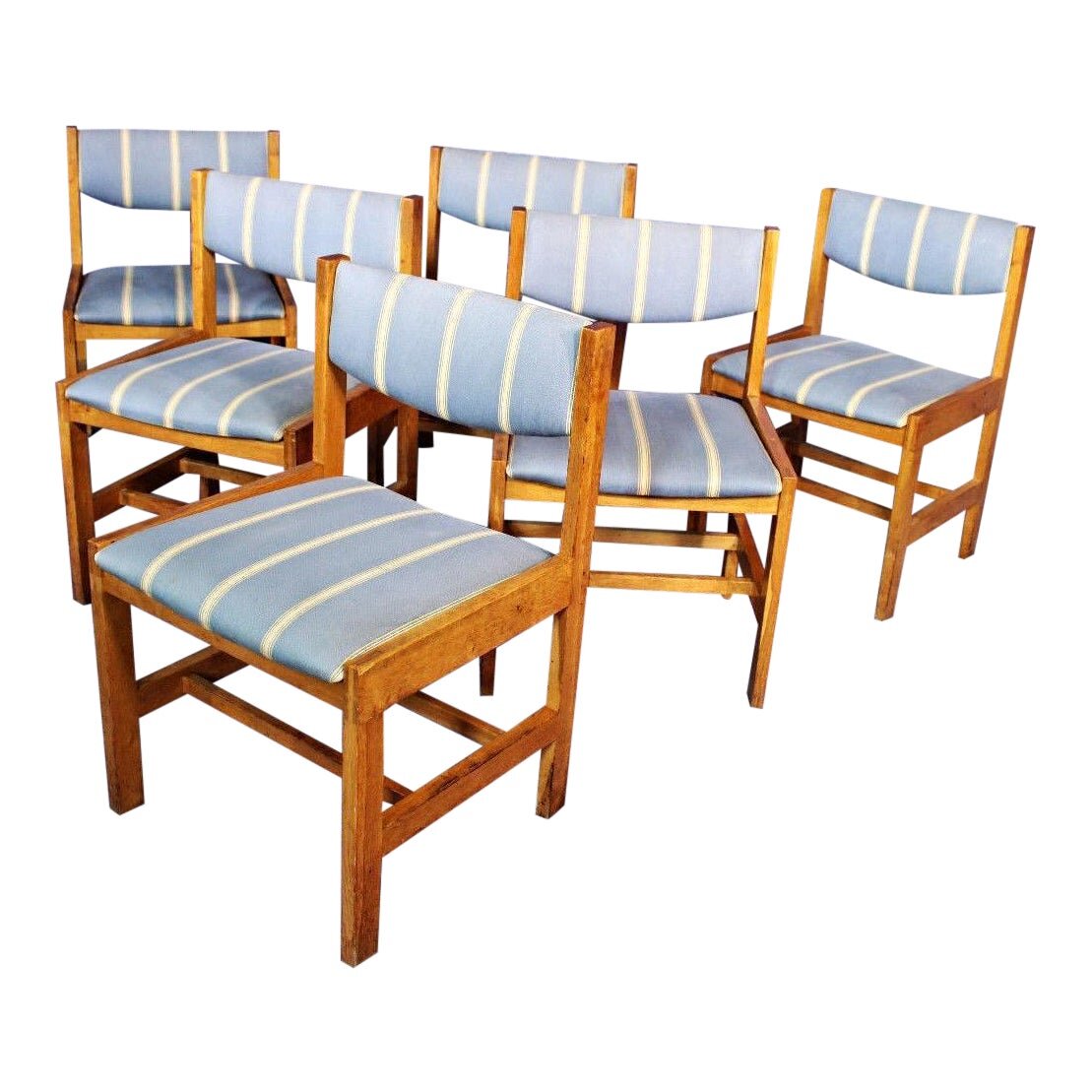
Next week I’ll be delving into the chairs I’m using within the room. There’s going to be a fun surprise around these chairs and although I won’t have them finished until the reveal, I’m excited to share the concept and process about having them get to where I’m planning they’ll be.
TO DO LIST
Finalize the ceiling color - DONE
Order paint - DONE
Order fabric for window treatments - DONE
Order fabric for doors - DOOR
Order fabric for wall sconces - DONE
Order hardware for window treatments - DONE
Order hardware for doors - DONE
Order glass and mirror for inset cabinet - DONE
Order rug pad - DONE
Order chairs- DONE
Order fabric for chairs - DONE
Prep and paint ceiling
Wallpaper back interior of hutch
Boards for hutch interior
Wallpaper room
Upholster chairs
sew curtains for doors
Install hardware
Install window treatments
Oil and finish wood
Install furniture
Install accessories
Style room
Photograph room
Make sure to check out the other One Room Challenge participants by looking on the ORC website!