Spring 2021 - One Room Challenge Week 1

If you’re new around here, thanks for stopping by and welcome! I am Lauren Caron, an interior designer and the founder of Studio Laloc, an interior design firm based in Seattle, Washington. On the side my husband and I are remodeling our home that I’ve given its own hashtag #ourseattlecraftsman. We’ve renovated our kitchen, scullery, powder room, and in the last One Room Challenge, we refreshed our dining room. I’m excited to be participating as a guest again and hope you’ll follow along as we remodel the next space.
Ack! It’s that time again and I am (hesitantly) joining the One Room Challenge once again! I say hesitant because I have a lot on my plate currently with work being very busy, and just feeling the home renovation burnout. Can I say it, burnout is real and it is really hard to push through it. I just try to manage it by taking time off, then push myself to keep going… because the end goal is also very real. I use these ORC’s to create deadlines for myself (and my husband). External deadlines like these challenges are the only deadlines I can stick to (when it comes to our own home). I have a goal to ‘finish’ our house by September. Of course it won’t be entirely finished, but I really want it to be at a place where we can photograph it. And we’re at that point where we are pretty close, yet so far away.
The Before Photos
So without further ado the next room we’re going to make over for this season’s One Room Challenge is…. the primary bedroom + her closet! His closet will have to wait until we remodel the primary bath. But yes, we’re doing two spaces… technically! The bedroom is going to be a pretty easy makeover - not inexpensive, but fairly easy. And the closet will be where all the labor and hard work come in!
The bedroom is in a fine space and for many people it would be a great bedroom. I don’t really have too many issues with the current room and plan is to keep all the furniture - except for one chair. I also plan to keep color palette pretty similar to the existing palette. I’m just looking for a more finished and layered feeling space. So I’m finally going to be installing draperies with custom hardware, finishing the styling of the bed with a new lumbar pillow and custom bedspread cover, replacing the existing chair with a tufted bench that used to live in the living room, adding artwork to the walls (they’ve been empty for 3+ years now), swapping out the rug, and finally painting the walls a darker shade of off-white.
Before - Primary Bedroom
Before - Primary Bedroom
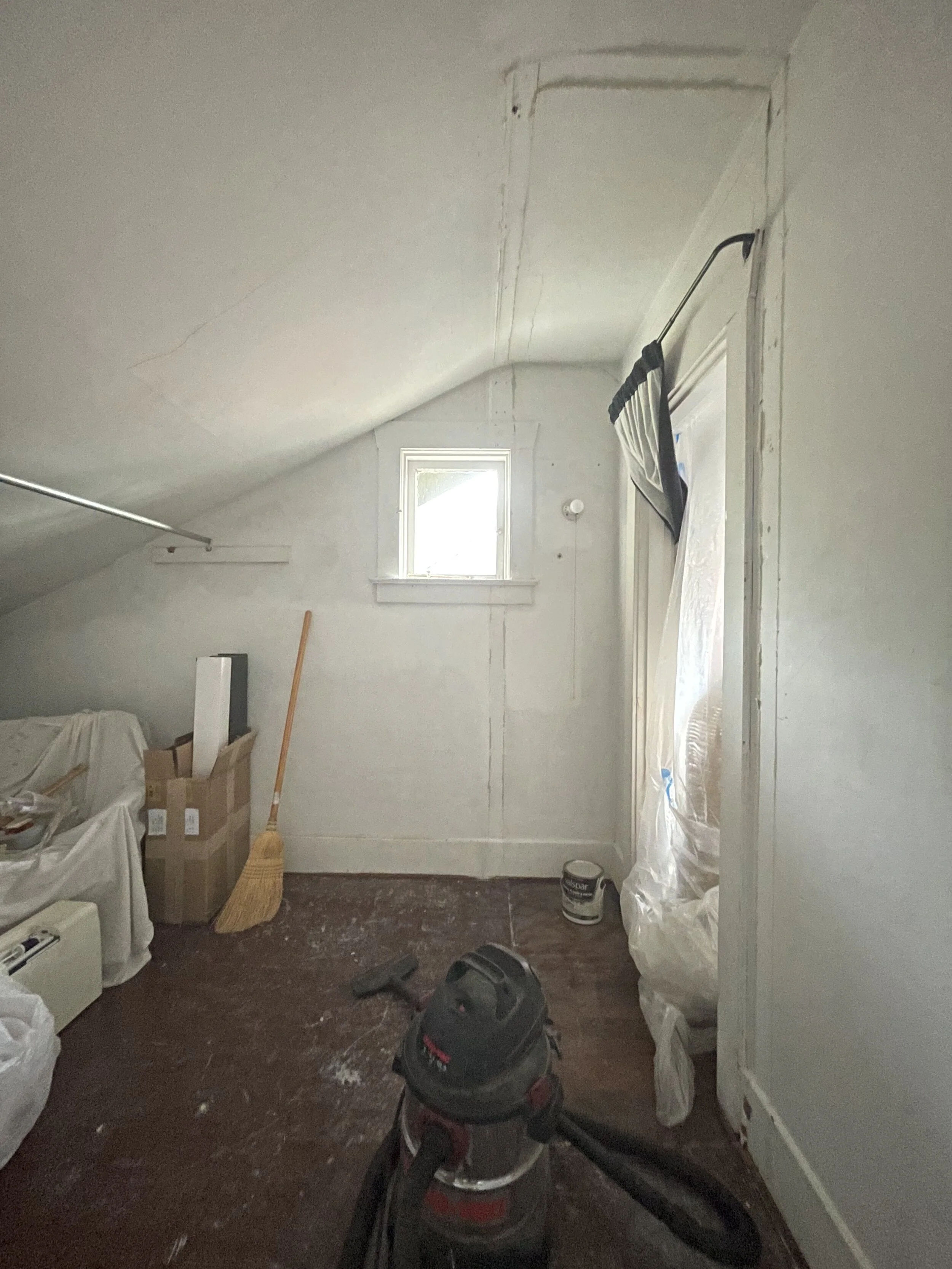
The closet however, needs a lot more work. It’s currently a vacant storage space that needs a full build out. The closet originally was built to be the closet for the room that is our office. The previous owners decided to cut through the wall in our bedroom to make that closet a second closet in the primary bedroom. Then they sectioned off a smaller portion of the space to be the new closet for the office. I understand why they did that, however I don’t like the way they executed it. They covered a portion of the window! I mean how weird, right? That floor plan modification however, was a great idea because now Jack and I both have our own closets (in theory).
Before - Her Closet / Dressing Room
I’ve decided that we needed to remove the small closet section and will close up the door to that closet from the office. If you’re worried that we’re closing a closet off from one room, don’t worry we can do the same thing on the opposite wall in the office and steal closet space from the guest bedroom if we ever need to, or for resale purposes. However, our office will remain an office for our purposes and a closet won’t be necessary. In Her closet as I’m calling it, we will need to build out the clothing bays, shelves and drawer systems. This build out will include glass doors backed with fabric, drawers, shelves, and a custom painted floor mural!
Before - Her Closet /Dressing Room
Before - Her Closet / Dressing, this is the door to the bedroom
Before - Her Closet / Dressing Room. It’s currently just storage for miscellaneous items and furniture. This wall will be the wall with the run of cupboard drawers.
Before - Her Closet / Dressing Room - This is the door to the office, the previous owners did not put a proper door on this make-shift closet, so we added a curtain.
The To - Do List
Bedroom
Paint walls and ceiling
Swap rug
Install Window treatments - hardware + curtains
Remove large mirror
Swap out chair for bench
Style bed
Hang artwork
Closet
Update Electrical to accommodate new ceiling light fixture
Build back wall to divide space from closet and storage
Build out closet components
Have Glass Doors Cut
Make fabric curtains for closet doors
Paint floor mural
Wallpaper Walls
Paint cabinets + Doors
Inspiration
The Bedroom
Sources (Left to Right): Jasper Fabrics, Zak and Fox, S. Harris, Farrow & Ball
I’m not entirely sure where the bedroom inspiration derived. The concept more so was inspired by this one fabric that I absolutely love (the fabric shown above on the left by Michael Smith for Jasper Fabrics) and haven’t found the right place for, until now. I kept coming back to it when I pulled fabric options for clients. But I felt like it was too ‘precious’ for my clients or perhaps too traditional and also, the color palette of a muted blue felt a little too I don’t know Americana. Yet, I kept coming back to it. So I thought, hmmm how about for our bedroom! And how can I make it not Americana. How can I push it away from the blue and red scheme to feeling more rusty, pinky, soft tan with an accent of muted blue?
From there I found a beautiful rusty velvet from S. Harris, and a dusty pink patterned fabric from Zak & Fox. And I decided the wall color needed to deepen a little. Just a little. So I pulled my favorite white paints from Farrow & Ball and Off White from Farrow & Ball, was just the right tone and shade with the fabrics and in the space. It all started coming together.
As far as any similar spaces or spaces that gave me some positive vibes and drove me to keep going with this idea… here’s what I can share. Although I can say our room, won’t end up looking like these rooms. At best they may have the same mood.
These first two rooms were designed by Robert Kime for Tory Burch. They’re located in Tory Burch’s Normandy home in France. The palette of reds, off-whites and hints of blue is very similar to the palette I’ll be doing. However, mine will be more muted and leaning more rusty pinks.
Design by: Ellie Walpole
The Closet / Dressing Room
Sources (left to right): Cole & Son, Schumacher, Benjamin Moore, Farrow & Ball
In the closet, I wanted to carry the pink through, but have a little more fun with the palette. So the biggest question was, “How could I do a PINK closet that didn’t feel Barbie Pink?” For the longest time I’ve had this coral toile wallpaper set aside for the upstairs hallway. I loved the way it played off the grey/green walls (Duxbury Gray) in a poppy contrast. But after a while I started feeling like the upstairs hall deserved a William Morris print. I mean we living in an Arts & Crafts style home, but we don’t have a single William Morris print installed? So that’s when I realized I could put WM in the hallway and use this beautiful coral paper in the closet! Et Voilà! The perfect pinkish color to play with for the closet came about. Then It was how can I pair this coral color with a pink (or pinks) that is not expected, and how can I paint the floor a fun pattern like I did the scullery! Well, ever since I first saw the painted Antoinette Poisson patterned floors in the Gucci store on West Broadway in Soho (which is now a wallpaper you can purchase through Gucci), I have been inspired to paint a floor in a similar weaving pattern. With that as my initial inspiration and a strange pink-ish palette I was off to the races. Figuring out the build out of a small space that I want to be both functional and beautiful requires some really great storage. But also, really beautiful storage. So the next bit of inspiration derived from traditional cupboard designs with the ruched fabric behind glass - I already did this downstairs in the dining room by the way. Here’s a few images I found that could come close to the style I’m going for.
The Gucci Floor Mural, by Antoinette Poisson in their Soho West Broadway Store
And finally, the mood board for the bedroom! As you can see I’ll be using the bedframe, wall sconces, and nightstands that we currently have in the space. The dresser my mother gifted me (it was my great-grandmother’s), the antique starburst mirror my parents gave me for my birthday one year, and finally the rug I bought over a year ago for the living room and decided will work better in our bedroom. The closet will be mostly all built cabinets, so a moodboard didn’t make much sense. But that space will have the large floor length mirror that is currently in the bedroom, with a neoclassical swan bench that I’ve had for years.
Lastly, I’d like to thank Linda Weinstein and the team at One Room Challenge . This is my third ORC, and the previous challenges I participated in, have been a wonderful experience. Challenging yes, but also wonderful! Thank you Linda for creating this event and keeping it going even through the most challenging of times! And thank you to the media sponsor, Better Homes & Gardens who makes this event possible!


