Le Tigre Bath Remodel Reveal, ORC - Week8

If you’re new around here, thanks for stopping by and welcome! I am Lauren Caron, an interior designer and the founder of Studio Laloc, an interior design firm based in Seattle, Washington. On the side my husband and I are remodeling our home that I’ve given its own hashtag #ourseattlecraftsman. We’ve renovated our kitchen, scullery and now we’re on to the Powder Room. This is my first foray in participating in the One Room Challenge partnering with Better Homes & Gardens, and I’m really excited to be a guest participant. I hope you stick around and follow along as we make our 70s bathroom into a modern day jewel box! If you missed any of the previous week’s posts please check them out via the links below!
WEEK 1 / WEEk 2 / WEEK 3 / WEEK 4 / WEEK 6 / WEEK 7
So it’s here, the reveal! This tiny but mighty little jewel box can finally sparkle. I am so happy I decided to participate this year! It’s just the motivation we needed to complete this space. I want to thank Linda the creator of the One Room Challenge for organizing, and Better Homes & Gardens for sponsoring this year’s event. Thank you to my sponsors Farrow & Ball for providing the paint for this room, and F. Schumacher for giving us an extra special discount on the fabric! I want to thank my friends for all of the guidance and support throughout this process, and most importantly I must thank my extremely patient and talented husband, Jack! For being truly AMAZING through this entire renovation! He for sure carried the brunt of the work, handling all the major labor from the demo to the electrical, plumbing and carpentry! His skills saved us THOUSANDS of dollars and I honestly could not have done this without him!
The Before
Let’s take a look back at the before photos and the design board as a reminder of where we started. When we purchased the house in 2018 we knew the powder room (half bath) would be one of the very first rooms to be renovated. It had bad faux wood paneling, vinyl flooring and an acrylic sink top. The cabin bathroom as our neighbors called it, had to go!
We demo’d the bathroom in July of 2019 when we began working on the scullery. I’ve written all about that decision in the Week 1 post, but I wanted to share the before post demo to give you all an idea of where we started for this challenge.
The Reveal
It’s All About The Details
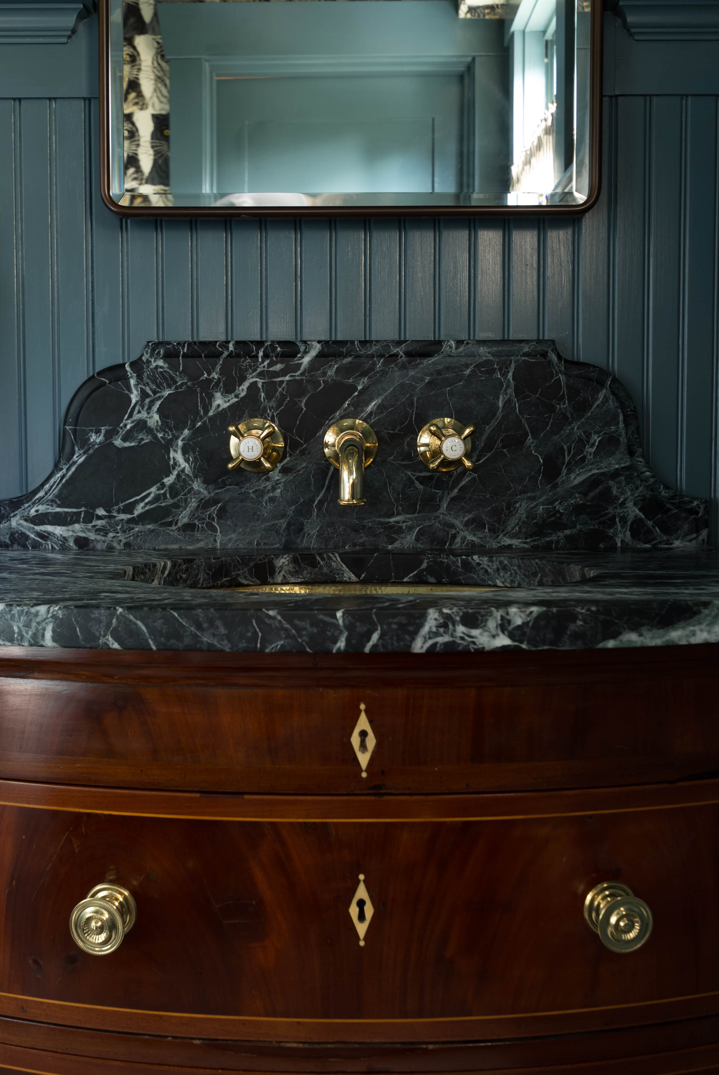
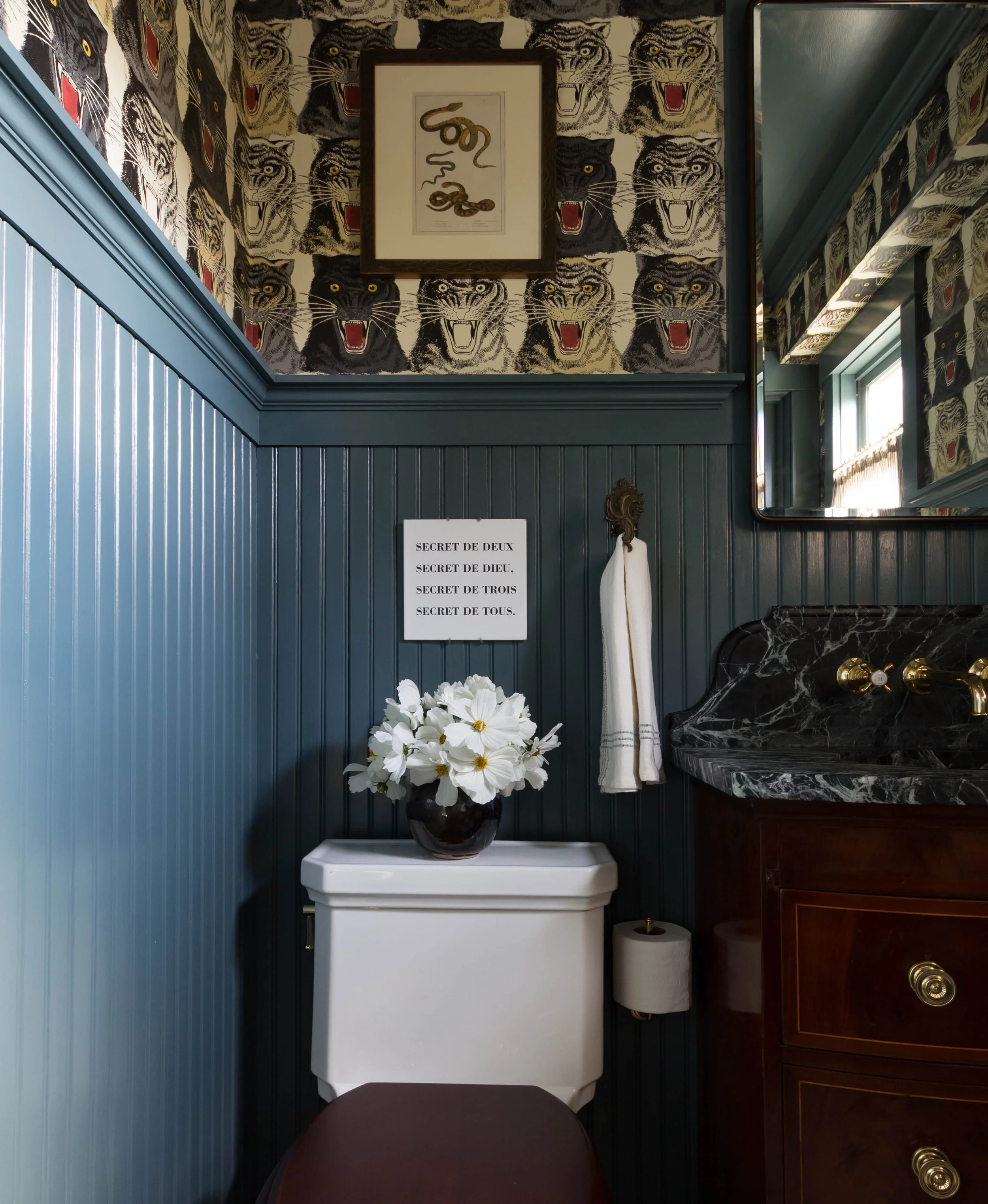
The top three major components in pulling this room together are the wallpaper, the tongue and groove beadboard painted walls, and the vanity with that soapstone top! I knew from the beginning when I started designing this room that I wanted it to be dramatic, bold and sexy, grounded in history that was relevant to the period of when our house was built. I was able to pull these intentions off with adding the rich deep paint color of Inchyra blue for the walls, and the bold, graphic Gucci paper for the dramatic effect. The historical or traditional aspects came through with the antique bowfront flamed mahogany chest, paired with a soapstone top with the ogee detailed edge. Other supporting elements are the 1” hexagon floor tiles and the 5’ height wood paneling. We went with beadboard instead of the typical craftsman style box paneling to match the scullery.
This room although small and only anchored by two pieces of furniture or fixtures (because I’m including the toilet) took a lot of work to pull together mainly because of the details. From the trim work of the tongue and groove paneling, to the wall mounted faucet on the ogee edge detailed backsplash, to the bordered marble floor tiles. Every step of the install had to be well considered and perfect (or near perfect) in order to work. The wallpaper caused me a lot of headaches, because it was not perfect the first time and I had to fix it. Those minor mistakes would not go unseen in this small space!
The dark counter set onto the dark walls and paired with the vanity is perfection IMO. I am happy I didn’t go with the calacatta gold marble, even though it still would have been beautiful, just not as special. For the most part I used unlacquered brass as the main metal finish and paired it with oil rubbed bronze for a few pieces, with the mirror and the switchplates. I am looking forward to seeing the brass components age and dull down a bit, much like how the towel holder has aged, which was an antique find at a flea market in Paris. The mahogany bow front vanity looks really great next to the mahogany toilet seat. I ended up pulling out brown tones in few other places like the rug, and the accent table. I believe the brown accents pull out the warmth in the floor as well.
Accents & Extras
As for additional accents and details, I ended up going with the classic Wesley ticking stripe fabric from F.Schumacher for the window treatment. I’m happy I did because it’s subtle and adds just enough softness to the space. I spent an evening sewing the pinch pleats in to add a little more appeal to the standard cafe curtain, which I think is really cute!
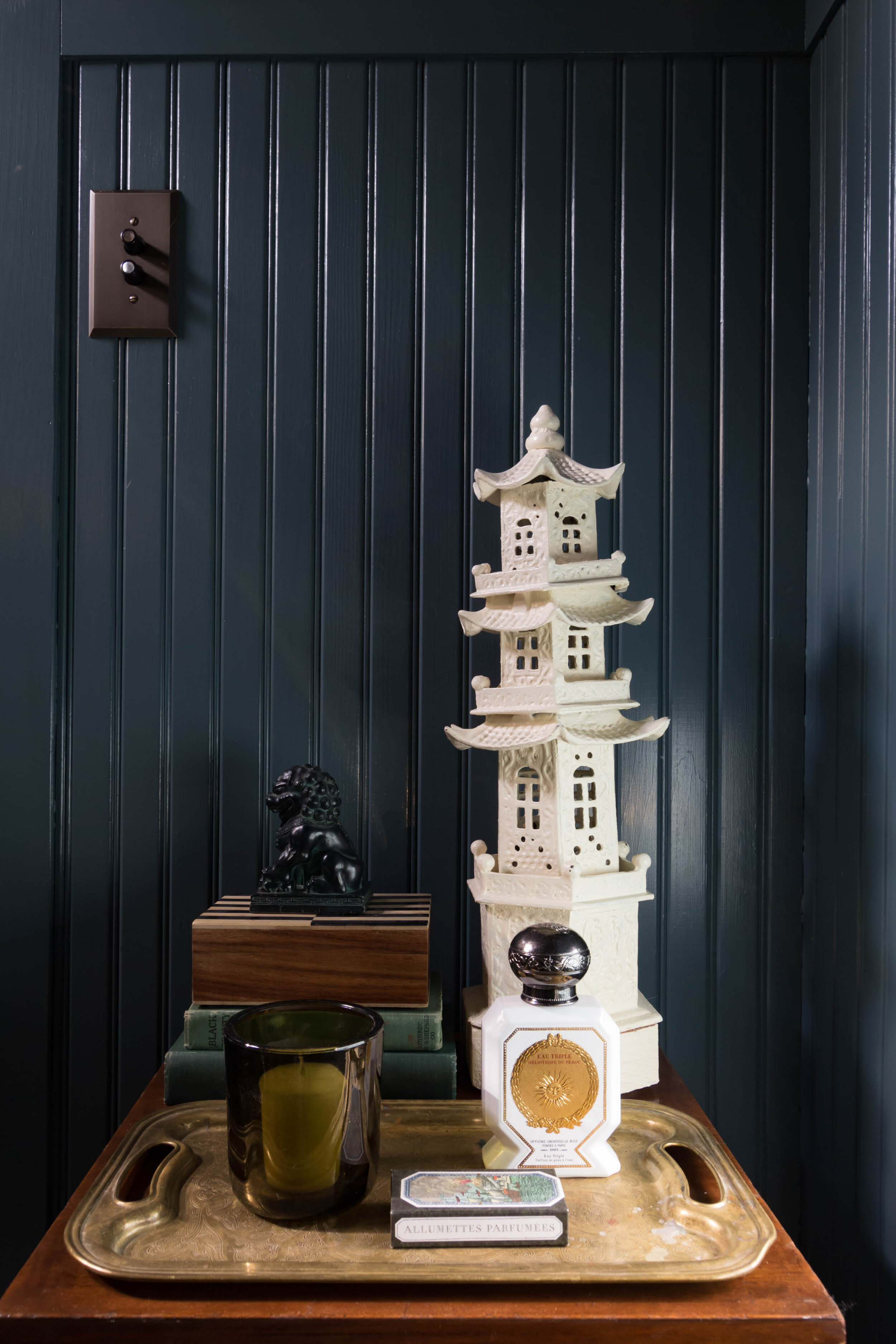
On the antique accent table, I’ve styled it with a pagoda that actually holds a tea light and provides a pretty glow for evenings that we’re entertaining guests. I felt the table needed height so it was the perfect accessory. The pagoda is a piece my mother gave me a number of years ago. The other items on the table are: a small vintage wooden box that my friend Kim gave me when she moved to London, two classic novels that happen to look great with the wall color, a candle, and my favorite Buly 1803 matches - they’re scented. I also added my Buly fragrance, imagining it would be nice to freshen up with. The foo dog is vintage. I’m still on the hunt for a pretty, vintage waste basket, but the for the time being, the large pot will work (also from Kim). The colors in the glaze work nicely with the rest of the palette.
The artwork is vintage as well. The snake print came from Chairish.com and the tile was from the Isabella Stewart Gardner Museum. My mother bought it a number of years ago and we haven’t been able to find it again. I love the rug, it was a last minute vintage purchase from Etsy.com.
The Sources
The Furniture
This is the example chest from 1st Dibs
The Vanity
For this room I decided that an antique cabinet would be the centerpiece of the furnishings. I found this chest on Chairish only a few months after we moved into our home in 2018. I believe it was $600 and for the price I had to scoop it up. I’ve seen these bow front mahogany chests sell for thousands. This one from 1st dibs for example. I’ve also seen them for virtually nothing at antique stores or on Facebook Marketplace on the East Coast. I’ve talked about the lack in good antiques in the PNW on FB Marketplace on my instagram. I’ll say it again here, It’s the pits! So if you can find a nice specimen at a price you’re willing to pay, I suggest you don’t wait. I had using one of these chests for a vanity in mind for years now, so I was ready to splurge on this item if necessary. But also knew we would not be getting to the powder room immediately, so I was also up for waiting until the right one came along. Which is exactly what happened!
As you know from my previous posts, I was deciding between a calacatta gold marble countertop to coordinate with the flooring, and a dark soapstone countertop to just be super pretty and work well with the wall color. The pricing for both came in very close. The countertop I was expecting to be inexpensive honestly, but unfortunately we live in the PNW and in a socially conscious city where labor is valued and there is a high minimum wage. In turn, the cost to have this item fabricated is a lot more than expected and rightfully so. I don’t feel comfortable giving exact pricing, but the remnant itself is 1/5 the cost of the entire price! It breaks down to the reality that where we saved on the cabinet, we’ll be spending on the top, so I guess it all works out.
The Toilet
The toilet is by Kohler, we purchased ours from Build.com. I like Build for a lot of my plumbing or utility supplies and fixtures. They have great customer service and good prices, along with a good selection. I would have loved to splurge on the Rohl, Perrin & Rowe Toilet that looks very similar but decided this is a place that we can save and still get good quality for almost the same look. To upgrade the overall look I found a mahogany toilet seat on Amazon and hunted down the sanitary handles by Perrin & Rowe - be ware, these range from kind of expensive to outrageously expensive. One vendor quoted me $425 for the pair!?
The Fixtures
Lighting
The light fixtures are by Visual Comfort, you can find a similar wall sconce here, and a similar flush mount here. Visual Comfort is good resource for quality lighting and when it comes to lighting, quality is really important. You can find cheap lighting but you’ll often see that it is cheaply made. You have to look at the finishes and the hardware. Often times, in cheap lighting, screws are exposed or the finishes are bland or dull? All that is taken into account when I’m shopping for lighting on a budget. Generally, you can get away with matte or dark finishes at a lower price point, but for brass the only type of brass I buy is unlacquered, or aged (unlacquered) and that comes with a cost. If I could say I loathed any finishes, they would be brushed brass or nickel. It just screams poor quality to me, even if it’s not. Give me an aged living finish and I’ll be happy.
The Faucet
The faucet is a splurge item, since it is one of the first items you see when you step into this room. It’s the Highgate lavatory faucet by Waterworks. I do love a wall mounted faucet and this just seemed like the moment to do it. Wall mounted faucets are not a contractor’s friend, simply because they require proper planning for the placement to be just right. If you could have been the fly on the wall listening to the conversation between Jack and I when we were discussing the height for this faucet… As I mentioned above, I ordered it in unlacquered brass and I’m looking forward to the days it turns and ages. One major point I’d like to make about plumbing fixtures is that you should definitely buy quality. A good faucet is like a good piece of jewelry in my opinion. Except it’s more useful and you will know the difference over the years. Quality lasts and cost per use makes the little extra you spend on your faucets and hardware well worth the investment over the years.
The sink could have been a standard ceramic white sink but it didn’t feel right for this room. So I wanted to go with something a little more fun and fancy. That’s where this hammered unlacquered brass sink comes in! The best part about this sink is that it’s actually quite reasonably priced.
Flooring
For the flooring, I knew exactly what look I was going for but wasn’t entirely sure of where I would source it from. I could have gone through my typical trade sources, but a quick google search turned up some options that were within a reasonable price point and the exact style I was looking for. I ordered samples - which is very important to do when selecting tile from online. They arrived and looked great. So I ordered more than I needed and was good to go. This is important, when ordering from online sellers they often have a limited quantity and what you need may not be available if you have to go back to order more. So always buy extra at least 15%.
The Medicine Cabinet
Now moving on to the medicine cabinet. I could have gone the traditional Craftsman style route and framed out a mirror on the wall, but I knew I wanted a medicine cabinet for this room. I also knew that I didn’t want anything with a bulky frame. So this one, seemed like the right choice. Going back to my finishes rant. They only sold this medicine cabinet in brushed brass, so I knew that would not be the quality I wanted. I went with the oil rubbed bronze on this item since it would look better in that finish. Also, this was an opportunity to bring in the second metal finish for this room. I was planning to use oil rubbed bronze switch plate covers to have them recede into the dark paint. And I always like to repeat a finish at least two times in a design so that it feels purposeful. Incorporating the oil rubbed bronze into the mirror frame was the perfect opportunity.
THe Wallpaper
The wallpaper came from Gucci and I’ve had my eyes on this pattern for a few years. I usually don’t like to go with ‘trendy’ patterns but since it’s been since 2016 and I haven’t seen this paper everywhere - the cranes are the more popular pattern from Gucci, I feel comfortable with my decision. I love that this pattern is both bold and neutral. The scale is terrific as well. Not too small, which is often the case.
The Hardware
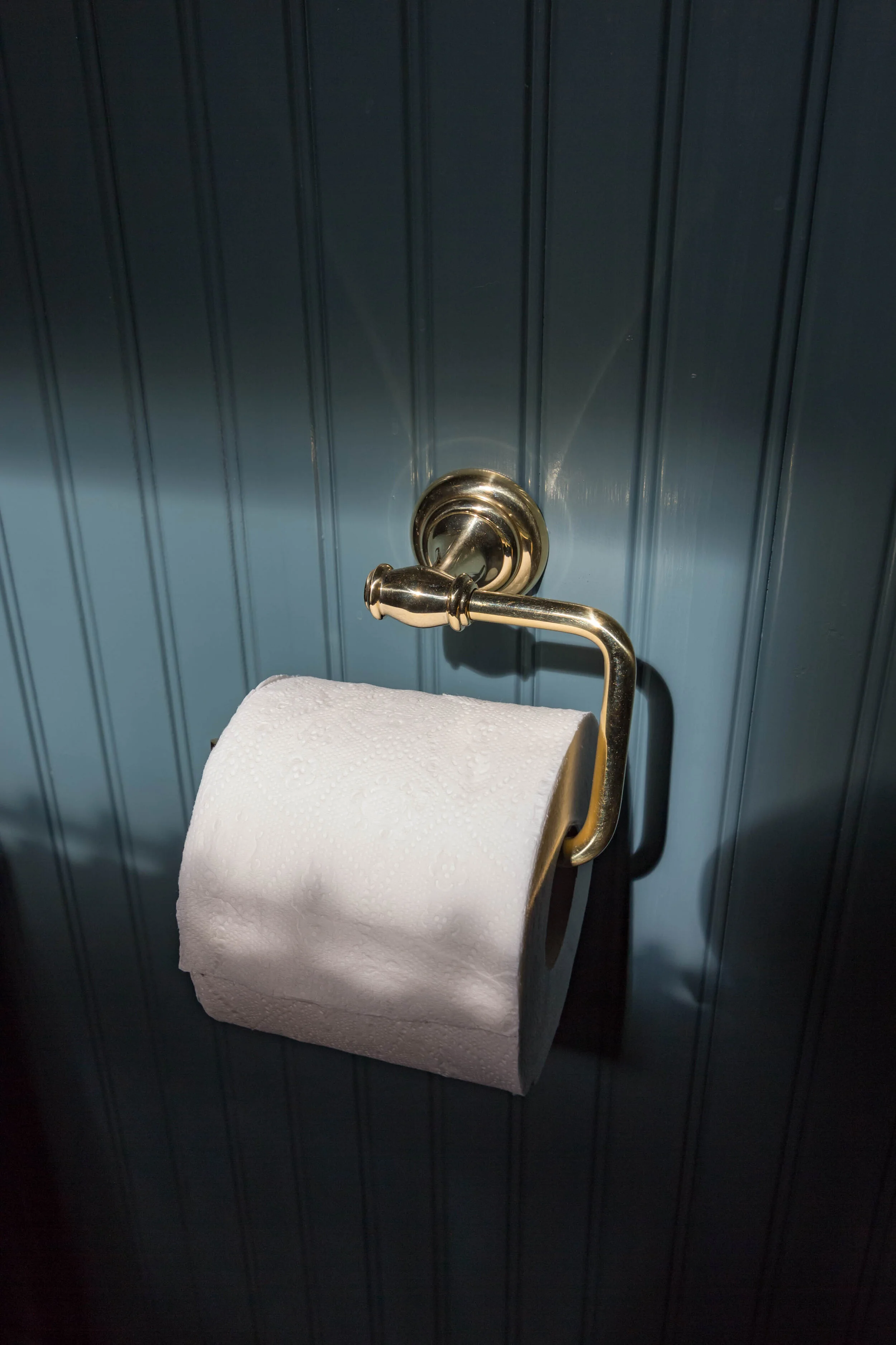
Last but not least, the hardware. I found the vanity cabinet pulls are from House of Antique hardware. They make pretty reasonable hardware that is often inspired by or remakes of traditional hardware. It was the perfect resource for my bow front dresser pulls and also for the little hardware extras of the door stop (which sadly, I didn’t put inside the room). The toilet paper holders are by Alno, from Build.com - vertical & horizontal. The switchplate covers are from Rejuvenation.
List of Sources:
Furniture
Vanity cabinet (similar)
Fixtures
Flush Mount Ceiling Light (similar)
Wall Sconce (similar)
Wallpaper
Hardware
Paint
Inchyra Blue No. 289 (gifted)
Fabric
Wesley Ticking Stripe (sponsored)
